to this:
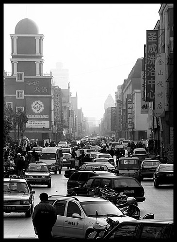
The first thing I do is choose a picture...
Next I print the picture out and use the print out to plan my layout of the piece, I use a colored pencil or pen to roughly sketch in the drawing or whatever is going to be on the "Photomation".
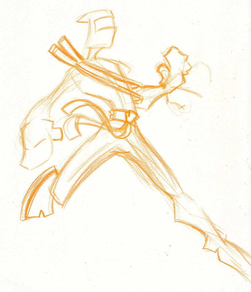
The next step is to draw the characters... I almost always draw in colored pencil. My reasons are three fold. 1. it eliminates the temptation to erase, drawing is a building process, you dont pour the foundation of a skyscraper and then dig it up before erecting the towers do you? 2. Colored Pencil does no smear. I tend to rub my hand all over my paper while drawing as I turn my sketch book every which way, and when I use graphite it just smears. and 3. when you scan it and start coloring in photoshop the colored pencil is easier to see and distinguish. When you scan your drawings makesure you scan them BIG this is important for the next step.
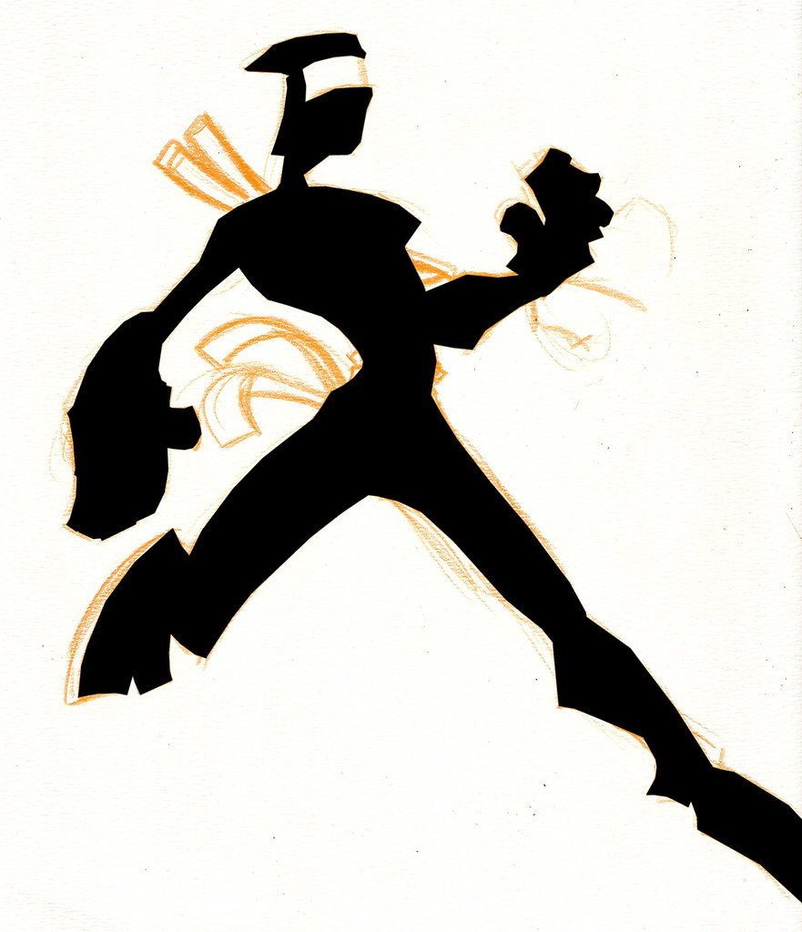
And that next step is to color your drawing in Photoshop! This is a pretty simple process, especially with these ninjas because they lack so much detail.
Some people like to clean up thier drawing a little before they start coloring, but I ussally dont see a point to it because the drawing will be thrown away, but I guess it can be helpful for selecting your lines, especially if you want to be lazy and use the magic wand tool, but the wand tool has never really worked for me adn you almost always have to go back and edit your selection in the mask. So, what I use is the Polygon lasso tool. I simply click around my drawing and select the areas I want to be colored.
Each color should get its own layer. with the ninjas I do the main body shape in black first.

Then, I start doing the details like the belt, swords, and "eye" part of the mask. Lyers are your friend, as I said every color gets its own layer. Most of the detail object layers are ontop of the ninja body layer, but a few of em such as the eye part, and the sword are on layers below the body layer, this way I dont have to select around the aeras so exact, because whatever extra areas I select will be covered by the layer ontop of it.
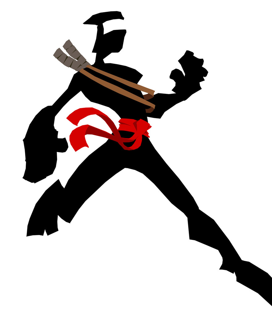
Lastly, I do shading and highlights. Because the ninja is so undetailed, there isnt much I do with this part on these drawings, infact I dont have any highlights at all, but there is some shading on the belt and sword straps... bassically I make a layer above that detail layer and apply my shading colors overtop of the base color layer. Once this is done you can get rid of the original drawing, and vioala you have a photoshop colored drawing that looks like a cel-shaded animation drawing.
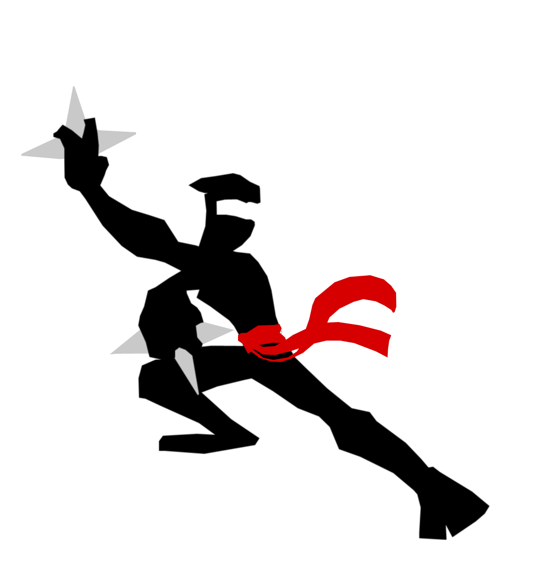
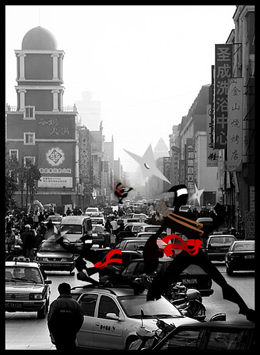
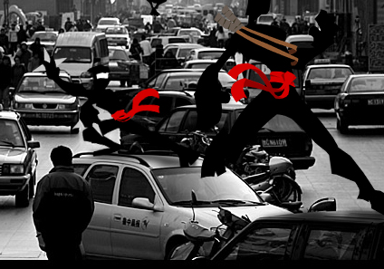
For this piece I also did two other ninja drawings, but I only remembered to acctually upload one to flickr, so here it is... notice I did even less detail on this one because he is going to be place dint he background.
One thing to note is that with these drawings I didnt have outlines with these drawings, but if you did want an outline all you would ahve to do is select the outline with your lasso tool and fill in the color just like you do with your bulk colors, the only difference is that the outline layer will be ontop of ALL the other layers.
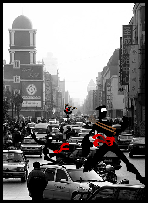
Now the fun part, placement in the photo. First thing you need to do is merge all the color layers of your drawing together, but make sure your still have a "transparent" (the grey checkerboard) background. Then you will need to open up your photo in photoshop. You may want to resize your ninjas down if your photo is alot smaller than your drawings... What I do is drag the full sized image into the photo (you do this by making sure the layer is selected, picking the move tool, and then simply dragging it from one picture to the next), and then I will resize the ninjas in the photo by using edit>free transform. This way I can resize and or rotate the image int he photo to make it fit. Remember to hold down the shift key while resizing with free transform, this will constrain the proportions of your image so it doesnt get stretched out on one side or the other.
Ok, so you placed your drawings in the photo, and sized em and rotated em how you want... done right? WRONG! now comes the part where you make it look like your drawings acctually belong in the photo.
First you need to add shadows. There are several ways this could be done. The way I ussally do it is I make a new layer, above the photo, but below my characters, and I use the paintbrush tool and paint in black areas where the shadows are goin to be, I use a soft edge brush so that it will be darker where I directly click but nice and fuzzy around the areas.
 Then I use the gaussian blur filter to blur out the shadow even more. Then I ussally change the opacity on the shadow layer to make it really seethrough and blend with the background below it. Finally I touch up the aeras using the eraser tool, again the eraser brush is very soft edged so that its not eraseing away everything.
Once the shadows are in, its just a matter of finishing touches. In some cases you may need to adjust the lighting on your drawings to match the lighting in the photo (especially with color photos) For instance if the photo is lit by blue lights you will need to make the drawings look as though they are lit buy blue lights as well, unless you really want them to stand out and not look like a part of the photo. Also applying blurs to your drawings can help alot too. If you have a figure in the background will will probably need to blur him out a little to give him some atmospheric prospective. The small leaping ninja in the background has 3 blurs on him in mine, a gaussian blur, and two different motion blurs, one that is applied directly to the character, and another that is applied to a duplicate layer (a copy) of the character that is behind him. The other two characters have no direct blurs on them except I think the throwing star ninja has a very minor Gaussian blur on him. What I did for those two ninjas is, instead of directly blurring them, I duplicated thier layers twice, I placed one duplicate behind them, and one infront of them. I applied a heavy motion blur to both duplicates, and then set the opacity on the layer behind the figures to about 40%, and the ones in front of the figures at about 13%. I then moved the duplicates back a little to make it look like they were moving in one direction. On the throwing star ninja I really only wanted it to look like his arms were moving, so I used the eraser tool to erase out part of the motion blur layers.
And there you have it.

1 comment:
Would you mind if I used one of your ninjas as a 'doodle' on a site I'm making. He's just so perfect for what I need.
Post a Comment